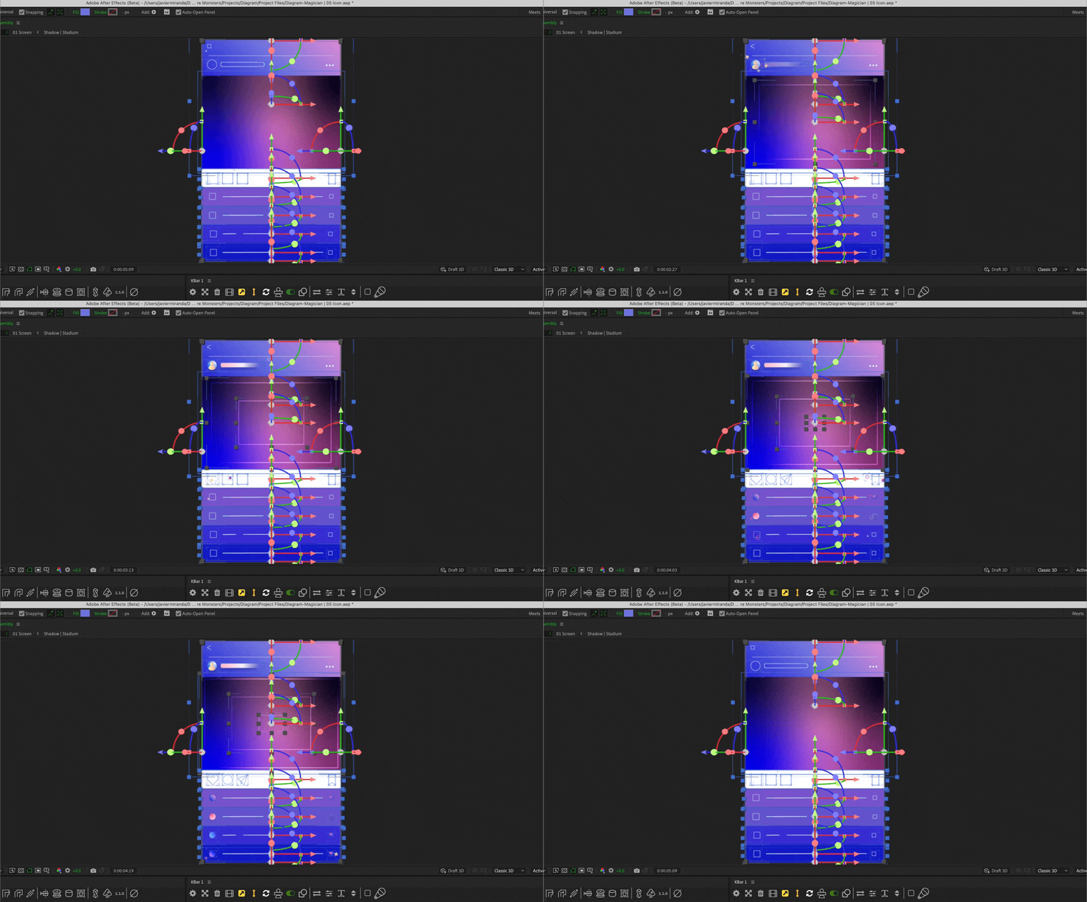
Picture this: you’re deep in the design trenches, fighting off a creative block, the deadline is advancing, when suddenly, (and with a clunky mix of metaphors) Magician appears out of nowhere.
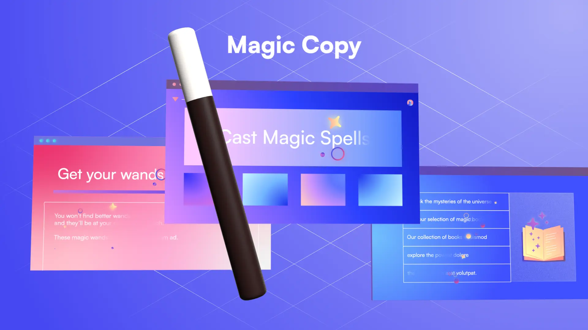
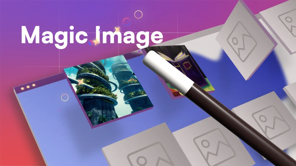
With a wave of its AI wand, it conjures the perfect icon, crafts the ideal copy, and generates stunning images, all without breaking a sweat. It’s not just a plugin; it’s your creative escape artist, freeing you from the mundane and unleashing your imagination in ways you never thought possible.
Inspiration
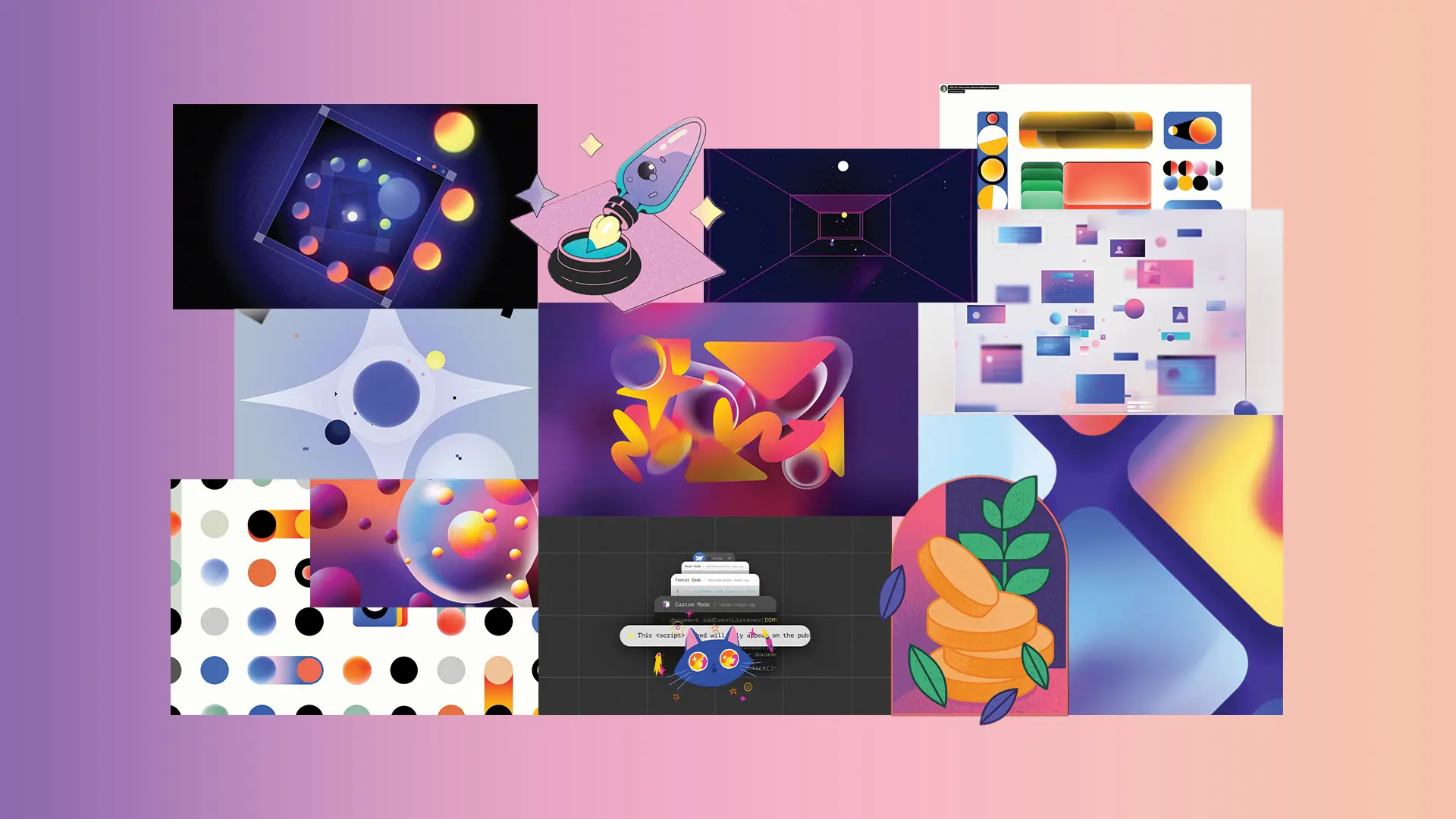
Creating the visuals for Magician required a magically colorful journey. The visuals should be as enchanting as the spells themselves, ensuring that every icon, image, and color reflects the magic Magician brings to the design process.
Color would always play a significant role in bringing the magic of Magician to life. By incorporating bold, striking colors, the aim was to infuse each visual element with energy and dynamism. These colors weren't just visually appealing; they were chosen to evoke emotions and spark creativity. Bright blues, radiant yellows, and vivid purples created a palette that was both modern and enchanting, perfectly aligning with the innovative spirit of Magician.
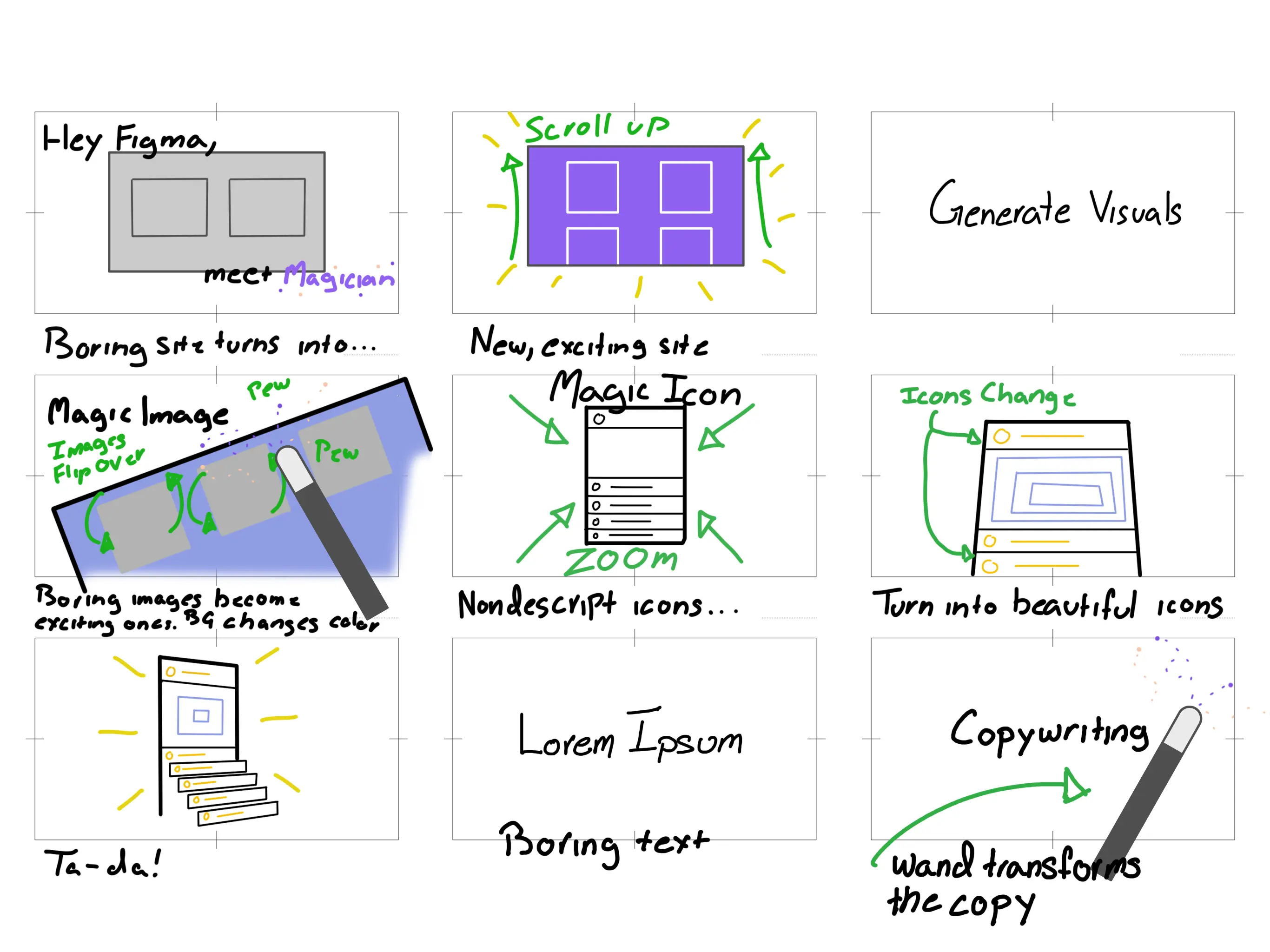
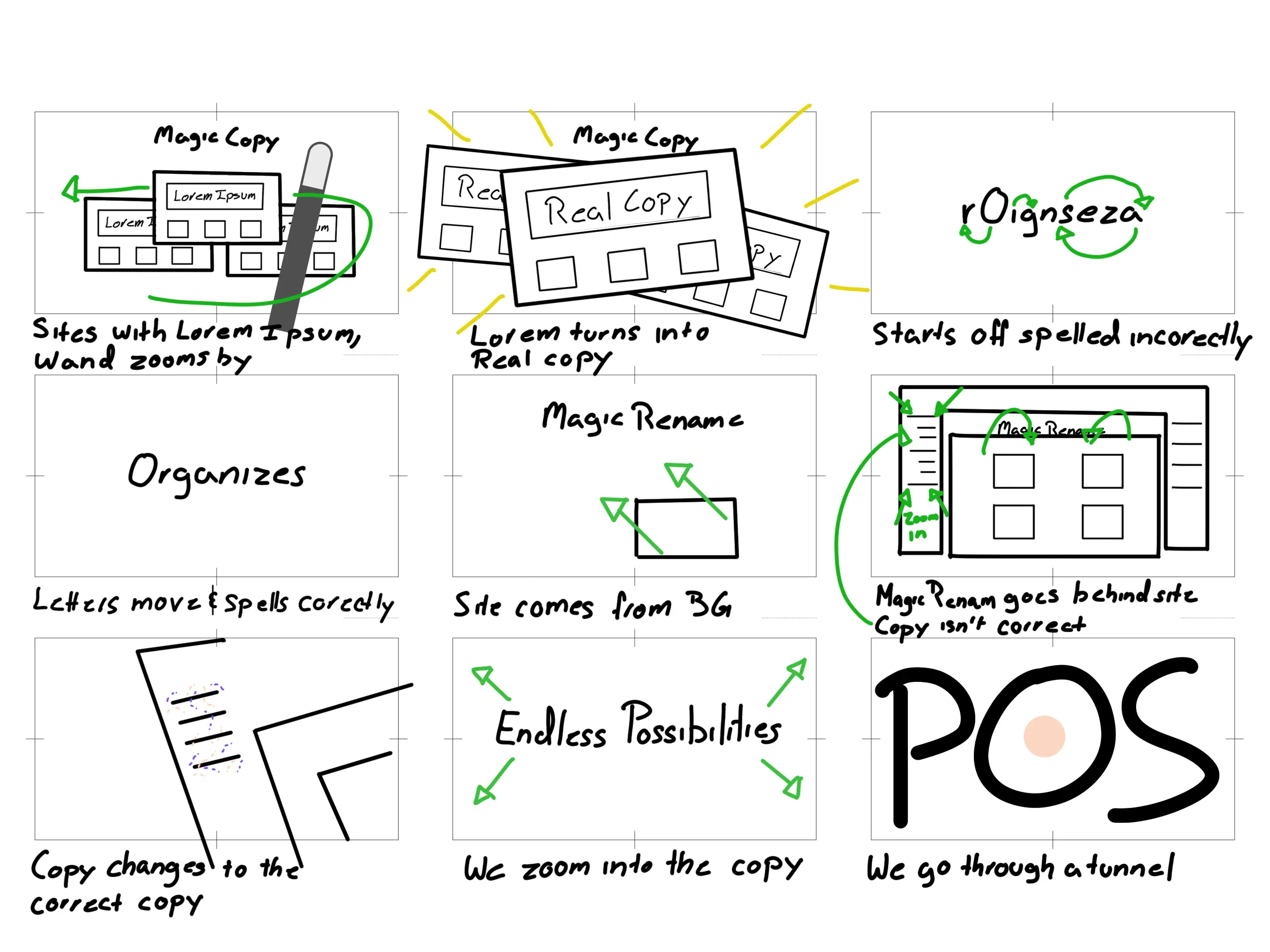
Storyboards
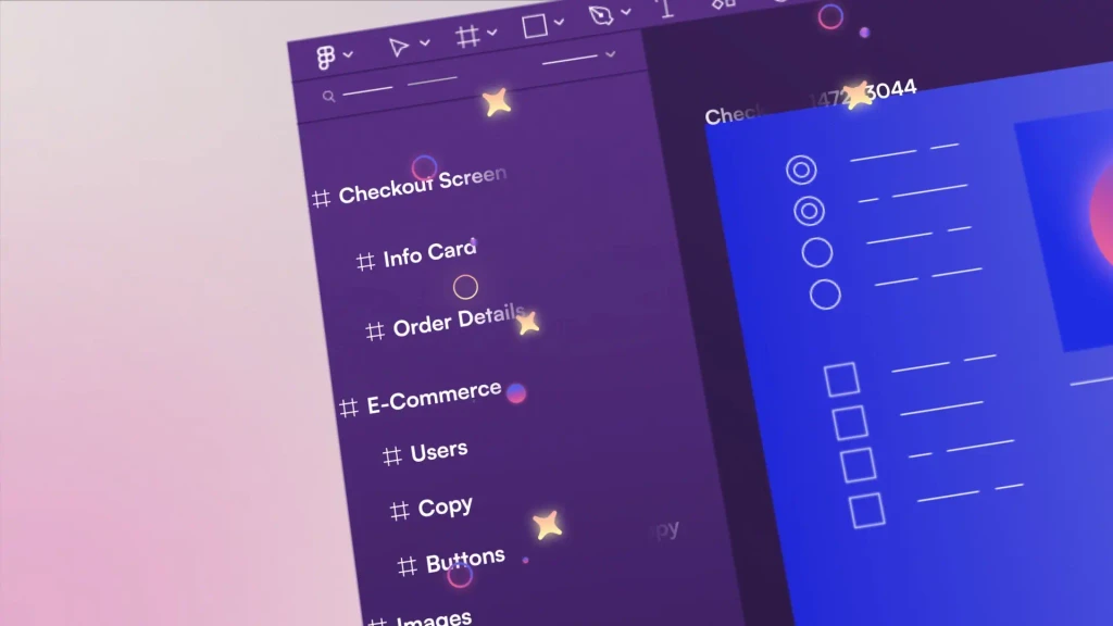
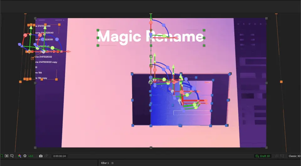
The true magic of motion graphics is in the storyboards, sketching ridiculously rough frames to capture the essence of Magician’s narrative and visuals. The storyboards served as the map and the guide to seamlessly integrate the enchanting visuals into the Figma plugin, ensuring users are spellbound from the get-go.
The Lost Section
In the quest to create the video, there was one part that didn't make the final cut- a segment fondly referred to as "The Lost Section". It was meant to showcase a holistic view of the plugin, how one plugin contains these different parts, but when the video was taken as a whole, it disrupted the flow a bit too much to be useful.
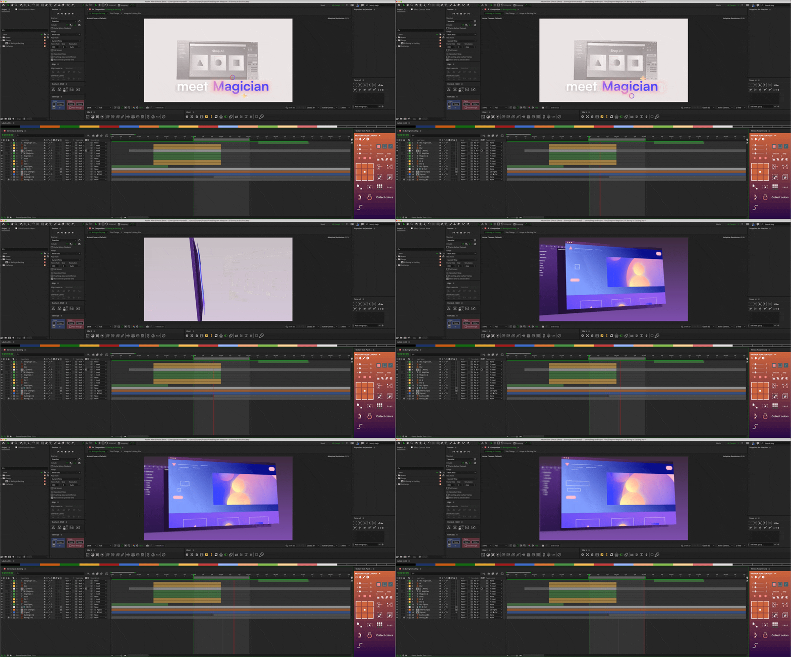
There's a saying in Spanish, "Del dicho al hecho hay mucho trecho", and in this case you can say, "Del storyboards a final animation hay mucho trecho"
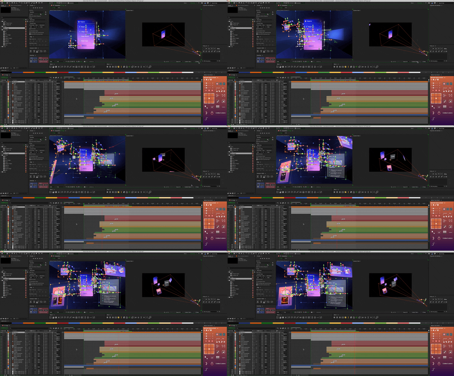
Behind the Scenes
